


TeeGrid for VCL/FMX [23 OCT 2024] RELEASE 1.17
Announcing the availability of the latest TeeGrid for VCL/FMX 1.17 release with RAD Studio 12 Athens Update 2 Patch 1 (RX/DX/CX) support.
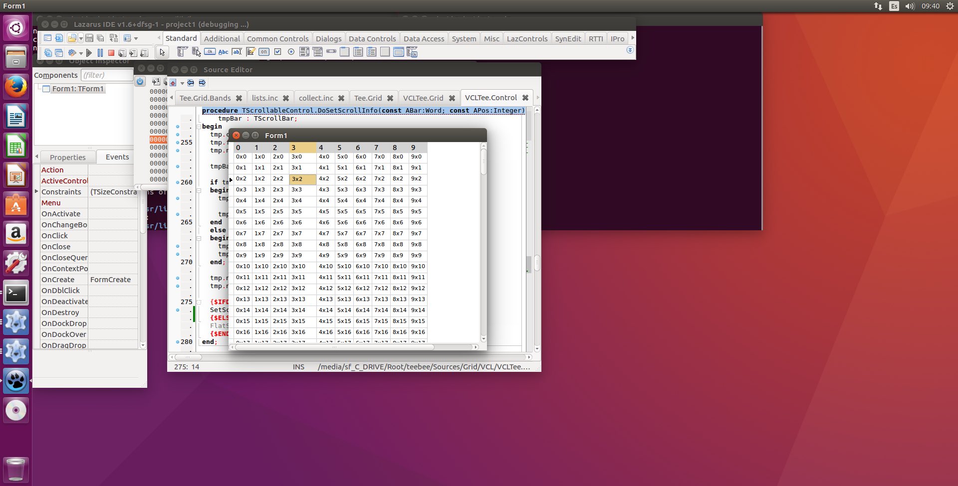
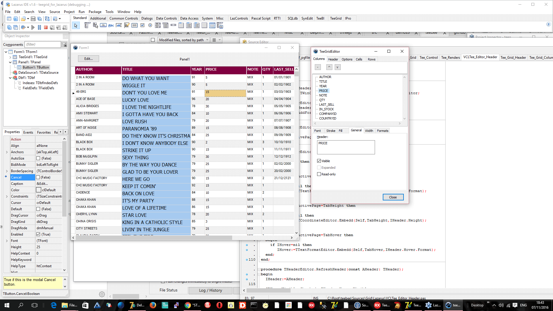
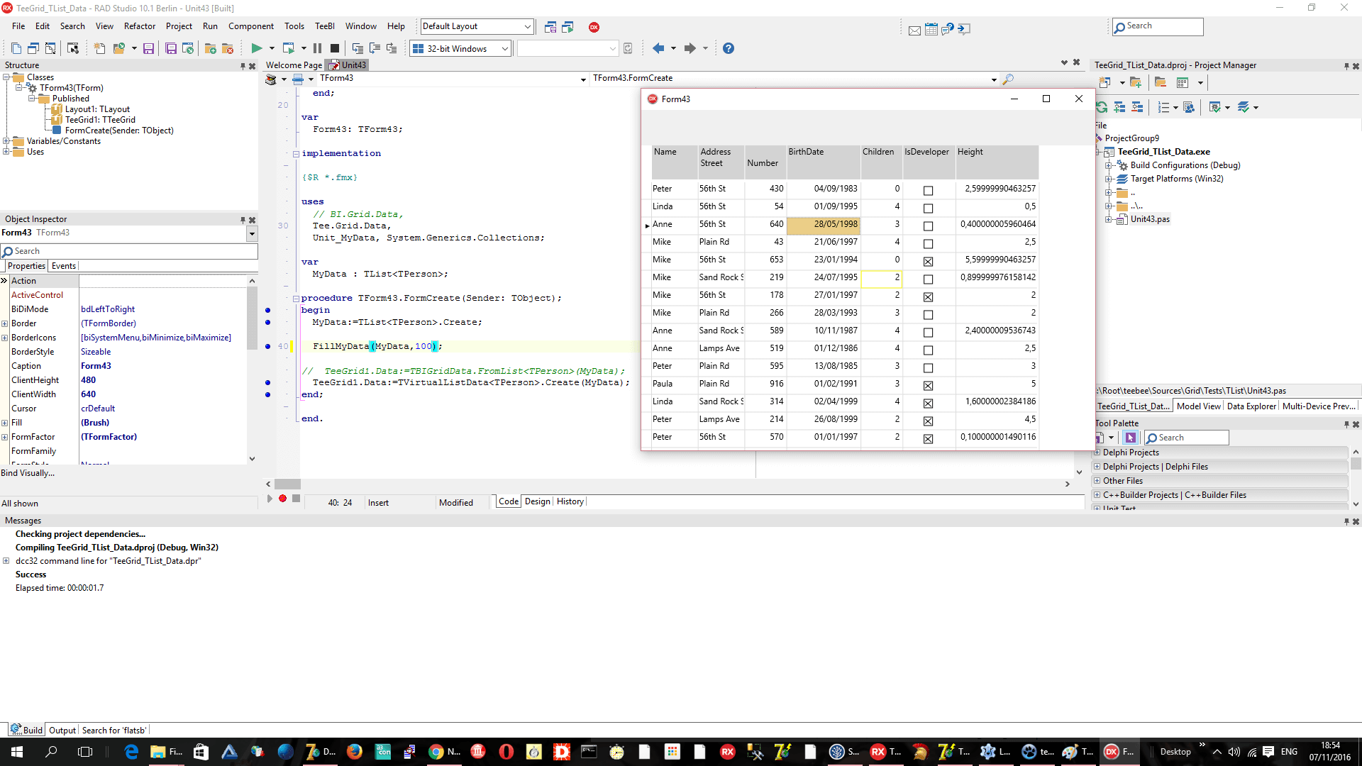
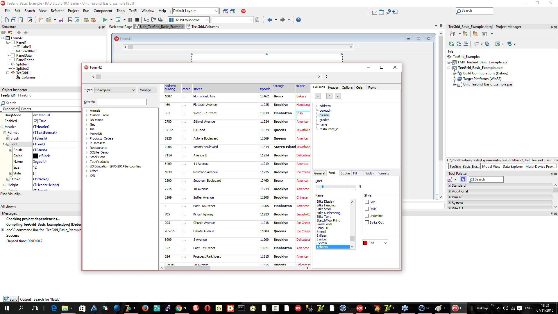
 VCL / FMX


(Current build: v1.17, Other Version history)
Announcing the availability of the latest TeeGrid for VCL/FMX 1.17 release with RAD Studio 12 Athens Update 2 Patch 1 (RX/DX/CX) support.
Announcing the availability of the latest TeeGrid for VCL/FMX 1.16 release with RAD Studio 12 Athens Update 2 (RX/DX/CX) support.

Announcing the availability of the latest TeeGrid for VCL/FMX 1.15 release with RAD Studio 12 Athens Update 1 (RX/DX/CX) support.
We offer discounts when purchasing more than one license. Discounts are as follows:
The volume discount will be automatically calculated if you are making your order online. You just need to enter the quantity of licenses you want to order. For special requirements, please contact us at sales@steema.com
Steema Licenses are perpetual and sold on a subscription basis. The subscription period is initially for 12 months, renewable annually and includes
access to updates and support forums. Please see the Subscription licensing page for complete details.
When the subscription period expires you can optionally renew your subscription for an additional year at the renewal price.
We will notify you via e-mail at least 30 days prior to the expiry date.
If your subscription has lapsed over 30 days, the renewal price will not apply and the cost will be that of a license upgrade price.