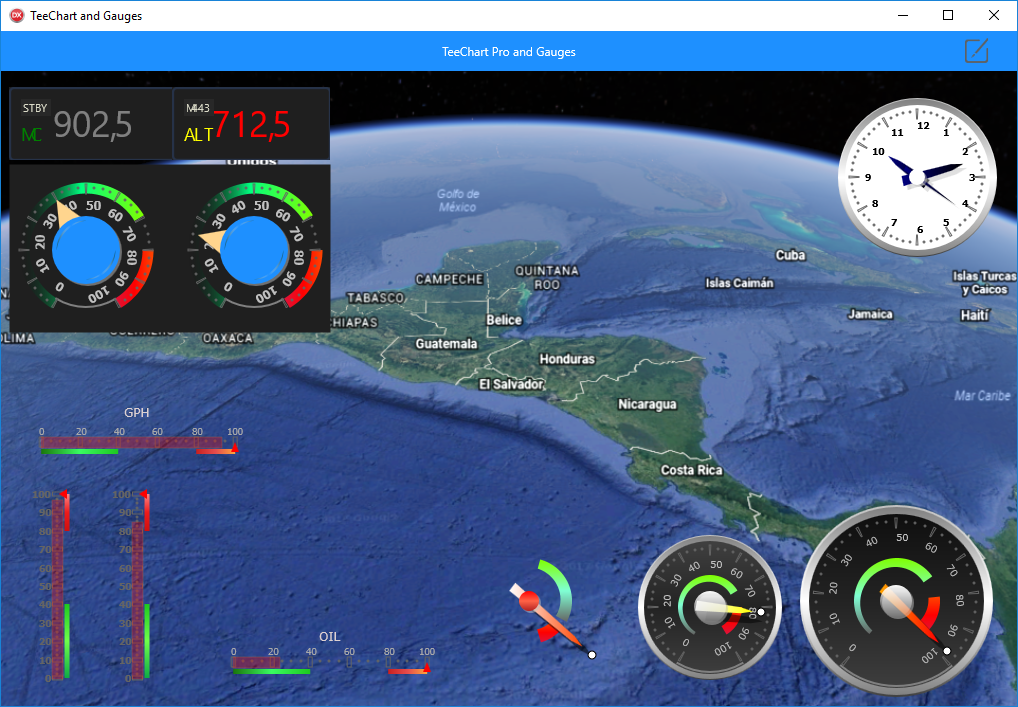
Gauges are increasingly used in our applications. Their capability to show different data sets, whether static or moving over time, makes gauges a valuable chart for dashboards or any other application which visually represents data.
First impressions count, and it’s important to understand data at a quick glance. For this reason dashboards are on the up and becoming increasingly more prevalent in modern data applications, hence we are seeing the many different types of gauges playing a vital role in dashboard design.
In this blog article, we’re going to look at the possibilities that TeeChart VCL/FMX offer us to simplify and speed up the creation of this type of data visualisation.
TeeChart Pro for VCL and FireMonkey include numerous professional chart styles, amongst which we find a wide range of gauges. It’s easy to start adding gauges to your Apps with the TeeChart components library. We can create the panel or dashboard we are referring to without the need to write a single line of code, and what’s more we can do so for all platforms supported by Embarcadero, making it an important cross-platform tool.
Note that all the functionality contained in the TeeChart Pro library of components is cross-platform compatible.
To begin with, let’s take a look at all the gauge types available with TeeChart Pro:
image1
If we create a new application, display its form and add a TeeChart Chart to it from the component library, we can then double-click on the Chart to open the Chart Editor. From here we can add Series to the Chart and personalise them to our taste, all at designtime. To add a new Gauge Series we select ‘Add’ from the ‘Series’ section and go to the Gauges tab in the gallery that has opened, as you can see in Image 1.
Types of Gauges:
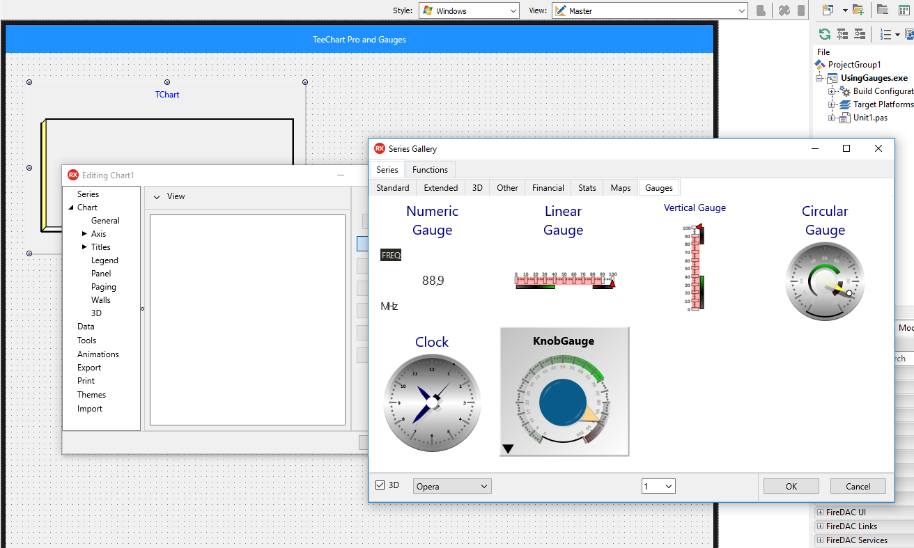
| Numeric Gauge | Linear Gauge | Vertical Gauge |
 |
 |
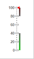 |
| Circular Gauge | Knob Gauge | Clock Gauge |
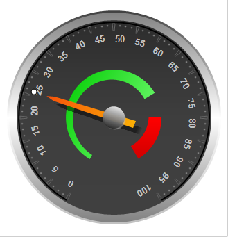 |
 |
 |
Each Gauge type has its own characteristics and functionality.
In this example, we’re going to add as many charts as there are gauge types available and we’ll change the appearance of each one of them via each of their respective editors.
TeeChart allows us to personalise each Series from the Object Inspector (and in VCL also from its own Editor dialogue).
image2
We can download the demo from the Steema area on GitHub:
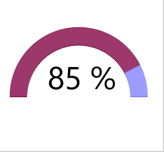
Using TeeChart we can always create any type of Gauge or Chart personalised to our requirements, that being because the TeeChart Canvas allows us to paint any object on it.
For example, if what we want is to create a type of Gauge of the style ‘Radial Gauge’ we can easily create it via a Donut Series. We’ll simply need to set a total angle (for example, 180º), position the Donut in the centre of the Chart via the 3D editor tab (using horizontal and vertical offset), adding an annotation tool in the centre for the dynamic percentage information.
Having done that, it’s only left for us to add values to the Series (for example 15 and 85). The result being:
Get more info and download the latest TeeChart Pro for VCL and FMX version at :
https://www.steema.com/product/vcl
you can check your own advancementdigital force gauge