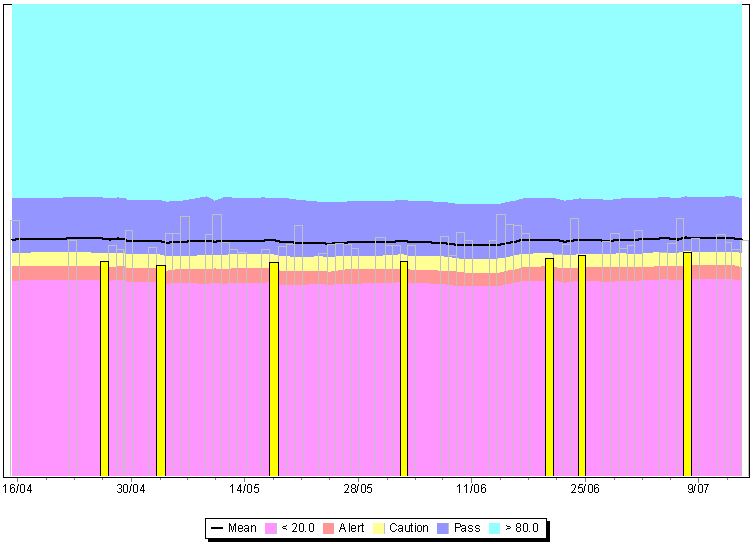
About RomteckRomteck Australia Pty Ltd is a general-purpose research and development engineering company, having a strong background in both hardware and software design. While we develop solutions on demand, our longest lived product-lines are in telemetry, fuel management, fire-alarm monitoring and safety technologies.Describe your ApplicationOver the years, we have used TeeChart in many products. I will focus on one of our safety products, OSPAT (Occupational Safety Performance Assessment Technology) – a human fitness-for-work assessment system, which uses a Windows client for display of current and historical performances.TeeChart is used extensively in the reports, allowing rapid visualisation of extremely complex data. More information about the OSPAT system visit: www.ospat.com Why did you choose TeeChart?Our initial decision to use TeeChart was guided by the inclusion of the component suite in an early version of Borland C++ Builder. When we reached the limits of what was possible with the included version, I requested that we continue with the TeeChart Pro version. This chart shows how consistently a single person has been performing their assessments over an extended period – the “good” results are shown just in outline,
to prevent the “interesting” results (unsatisfactory) being hidden.
This chart shows the complexity of charts that can be achieved with very little coding – a 100% area chart, overlayed with a line chart, overlayed with a bar chart.
 These two charts show the performance of a single assessment. The top chart shows the amount of input-movement by the user (in red) and the actual assessment (in blue).
The lower chart shows how difficult the assessment was from second to second through the duration of the assessment.
The point at which the user’s score starts being accumulated is shown by the transition from blue to red, the thin black line shows the user’s historical average difficulty
and the pale blue background shows the variability of the user.
Describe a specific project challenge your company overcame using TeeChartWith several of the charts requested by customers, we needed combinations of line, area and bar graphs within the same chart. The straightforward class hierarchy allowed us to easily switch between different visualisations with very few code changes – often none. This made it easy for us to prototype the software and make in-field changes in response to the customer’s feedback.What benefits have you experienced from using TeeChart?It is obvious that TeeChart was properly designed from the ground up, by people who were extremely familiar with the often conflicting requirements of complex data visualisation. This has given the product an extremely stable interface – in over twelve years of using the product, we have not had to rewrite any part of our reports or chart displays to cater for changes in the API. With almost every other add-on component we have used, some degree of rewrite has been needed; with some, extremely extensive rework was required. After quite brief training, safety administrators are able to quickly perceive very complex data in a simple visual form.
Again, complex data made readily accessible. Each column has the height of the number of assessments expected to be performed in a day. Red are “alert” results (well below expected performance), yellow are “caution” results (slightly below expected), green are “good” results and blue are expected assessments that were not performed. Note that the solid blue bar in the second-last column was a public holiday Paul S Adams Senior Software Engineer Project Lead (OSPAT) Romteck Australia Pty Ltd www.romteck.com 
|
